Standing
in support
Together We Stand
Sector / Military family assistance
Agency / Zync Agency
Role / Senior design
SUMMARY
Together We Stand is a unique non-for-profit foundation that offers services and support to Canadian military families. This organization is the only one who puts the families first, and strives to show them that they are seen, heard and appreciated.
At its outset as a new and growing organization, a strong brand and consistent collateral was needed to successfully launch its directive and convey its message.
-
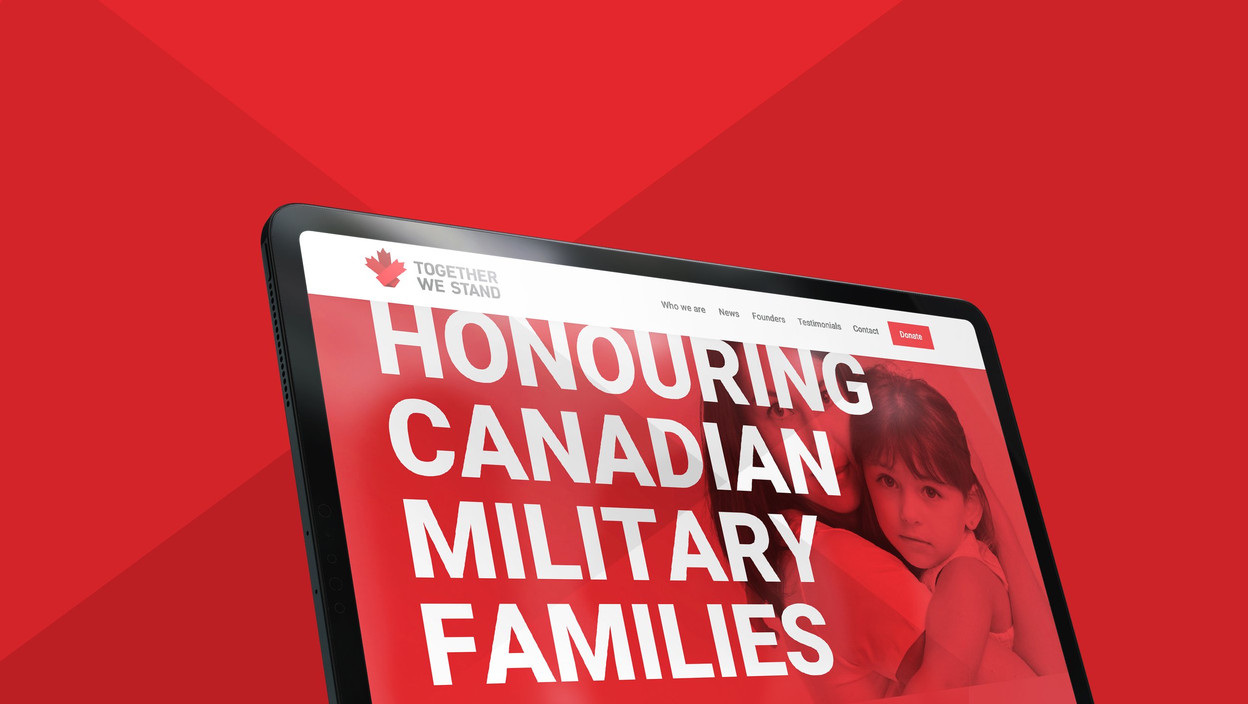
As an unknown not-for-profit, the logo was their first point of contact, and needed to be clear and direct. We used the iconic maple leaf to convey the essential Canadian aspect of the foundation. The concept of support was created by combining the maple leaf with the traditional awareness-ribbon symbol. The final icon creates a memorable and clear message.
The thick, elongated font used in the logo is reminiscent of military-style typefaces, but with a softer tone that emanates strength.
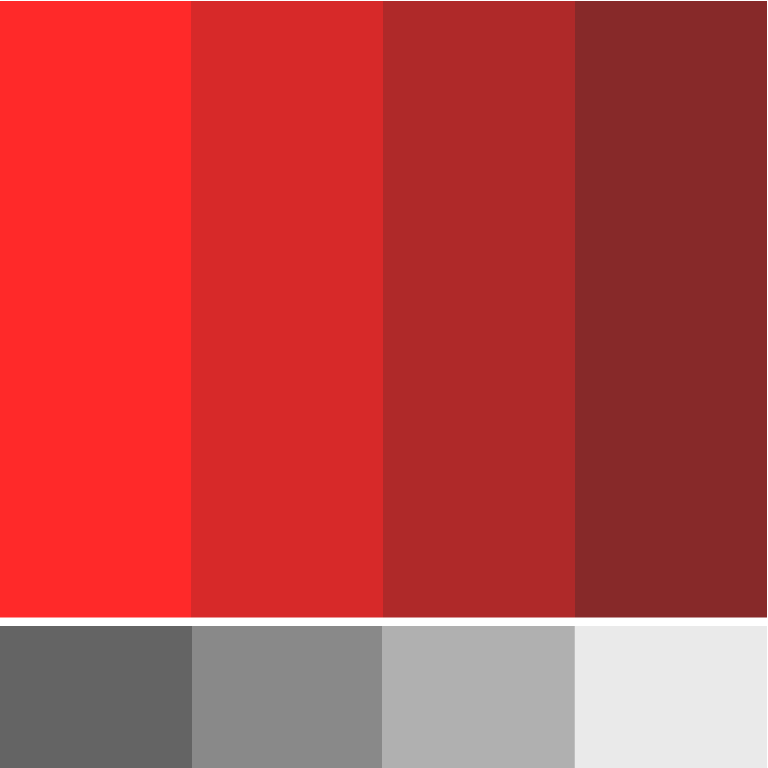
The visual language upholds the brands message – the colour palette feels Canadian, the angles reflect the maple leaf shape, and the caring, but pensive imagery reminds us of the military families that the foundation is supporting.
Today the brand has taken on a life of its own and continues to thrive and grow well beyond its initial phases. It has successfully expanded its operations and offers even more meaningful, personal and impactful support to Canadian military families.
SCOPE
Brand research
Logo suite
Visual language
Tone of voice
Brand collateral
Web creative
Pitch deck
Presentation material
Promotional material