Changing
real estate
Ettie Realty
Sector / Real estate
Agency / AECO Innovation Lab
Role / Creative direction & design
SUMMARY
Ettie offers expert real estate services using a unique client-focused methodology aimed at putting the client first. As a new brokerage with fresh ideas, it was important that Ettie’s brand be portrayed as transparent, approachable, genuine and offering truly modern, one-of-a-kind services to their clients.
Real estate services are plentiful and seen on every street corner, so one of the main challenges was creating a voice that would instantly set this new brokerage apart from the rest. The Ettie brand needed to be youthful, energetic, digitally-focused and as unique as their services were.
-
Naming was a huge piece to this puzzle, as there already existed so much competition in real estate, and the name needed to be unique, memorable and modern with room to grow. After extensive research, brainstorming, testing and deliberation, the name Ettie was selected. It feels personal, youthful, simple and perfect for an app. An extensive AI element was also planned for the future, so the name needed to work well as an AI assistant.
It was important that the logo be icon-based, as Ettie operated heavily in the digital space and offered its own custom real estate app. The icon had to be instantly understandable, recognizable and personal. The symbol of a building, combined with that of an individual creates a universally understood icon. The shape of the house and the shape of the person also create the hidden “A” and “I” letters, which nods to the AI capabilities.
The approachable tone of voice, often imitating conversational phrasing, is used throughout the brand materials and creates a friendly, personal impression. Colour, typography and graphic elements give the brand energy and youthfulness. Illustration allows the brand to avoid stereotypical real estate stock photography. Where photography is used, it is subtle, personal, genuine and client-focused instead of profit-focused.
These combined elements create a unique impression in the real estate world. Even if you are simply walking past Ettie’s for-sale sign by the sidewalk, the brand works hard to attract attention, generate interest and set it apart from the others.
SCOPE
Brand research
Brand strategy
Naming
Logo suite
Visual language
Tone of voice
Typography
Iconography
Information design
Illustration
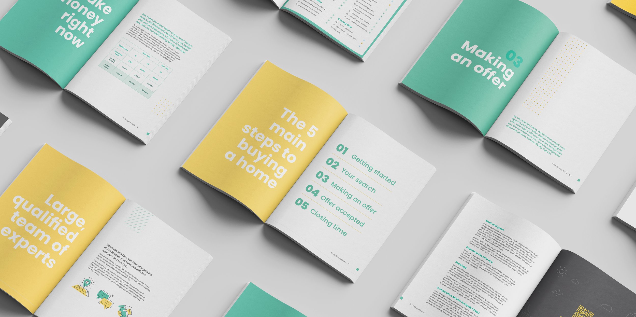
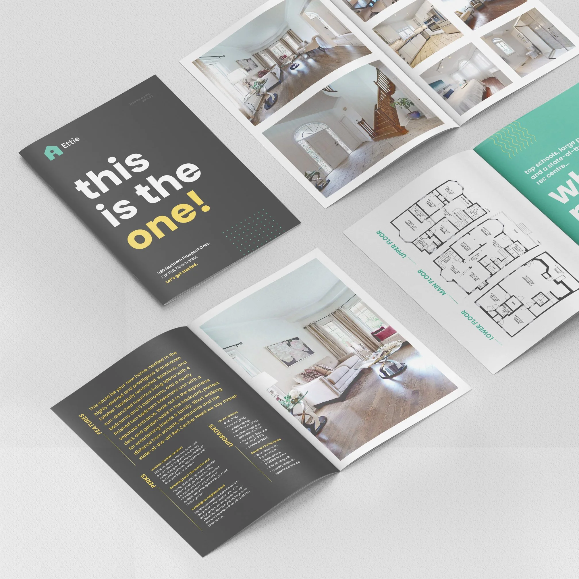
Brand collateral
UX/UI
Information hierarchy
App design
Signage
Booklet packages
Web creative
Conference materials
Presentation materials
Email design
Pitch decks
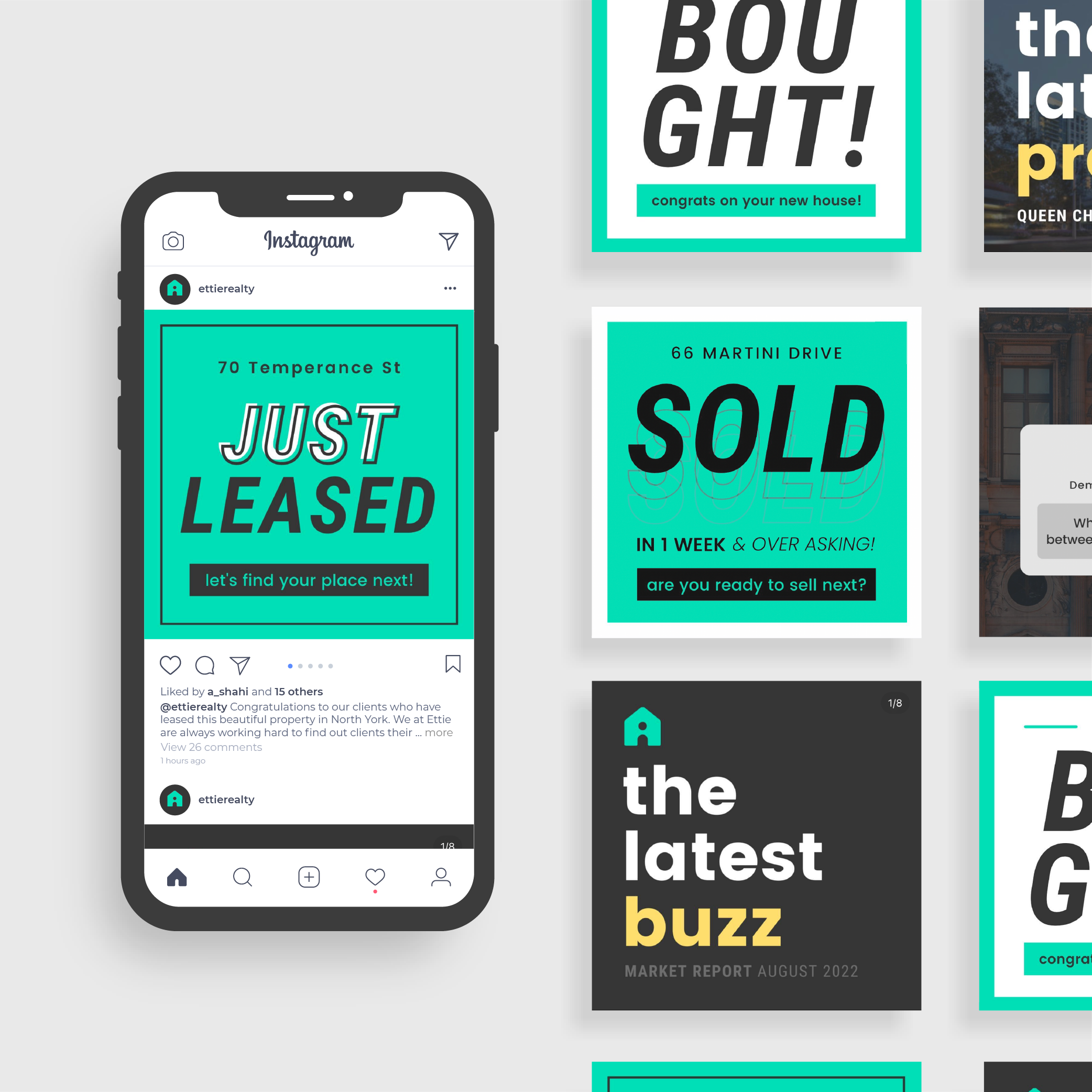
Social media design
Social media posts
Promotional material


THE APP
The Ettie mobile app and web-app is a fully-functioning real estate application that houses all the standard functionalities you would expect, but is also upgraded with unique Ettie exclusives, as well as registered agent features. The creation of this app was a huge endeavour, with seemingly endless features and functionality, research, demanding UX/UI execution, constant testing and de-bugging – and all wrapped up in the Ettie branding.
-
The goal of this app was to go above and beyond what is commercially available to the common user, and create an app that offers everything a buyer, seller or agent needs, from beginning to end. This not only includes search capabilities, but attaining and communicating with an agent, booking a showing tour, collaboratively documenting and sharing your showing experiences, rating potential properties, and more.
As the lead on the UX/UI and branding design of the app, it was an immense and involved undertaking. After working closely over months with stakeholders and developers, the app was launched in the App Store and Google Store. Since then it has continued to evolve and has generated interest from other real estate brokerages.


